尚略广告,是上海知名品牌策划设计公司,上海logo设计公司,上海vi设计公司,上海包装设计公司,上海画册设计公司, 尚略遵从国际服务标准,可以为客户提供从品牌策划,品牌定位、品牌命名,LOGO设计,VI设计,包装设计,宣传画册设计,网站设计,营销策划,平面创意广告设计、影视广告片策划拍摄、市场推广等一整套品牌全案策划服务。
具体包装设计服务领域,尚略已在农业农产品包装设计,茶叶包装设计,汽配润滑油包装设计,化妆品包装设计,食品饮料包装设计,快消品包装设计,母婴婴童包装设计,工业品包装设计,药品包装设计等众多行业拥有一定设计案例和经验积淀,
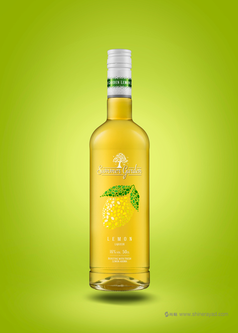
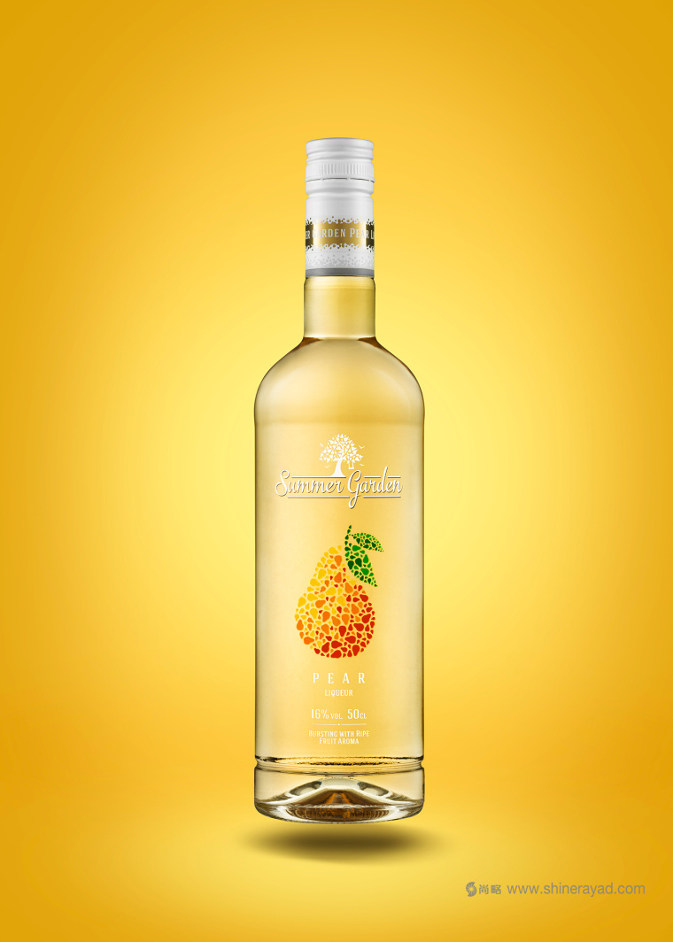
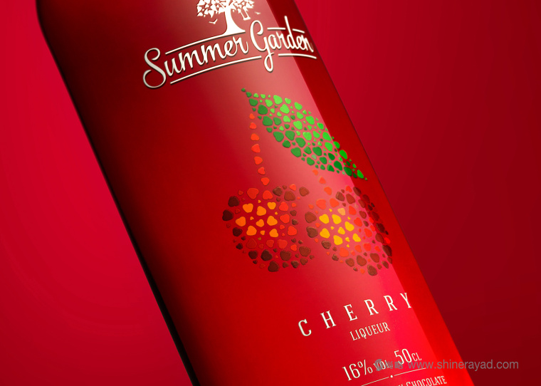
下面,尚略包装设计公司分享分享Summer Garden 夏日花园含酒精饮料包装设计案例及设计师的心理历程。
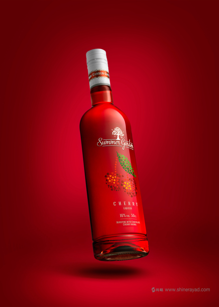
From a concept project to a project IRL.
Designer Edmundas Jankauskas never thought this reality
would come true, but after much development this once student has turned this
liqueur concept, Summer Garden into a reality.
包装设计师Edmundas Jankauskas从没有想过这个项目会从概念变成现实。但是这个曾经的学生经过一番努力把这个酒精饮料的概念实现了。
Nearly two years ago The Dieline published my concept
redesign (then just a student project) "Summer Garden". Since then
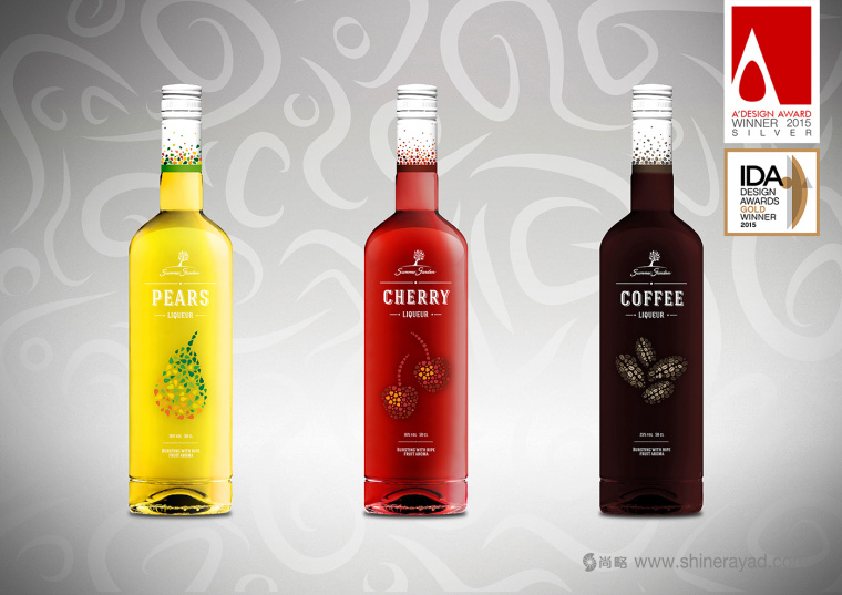
this project was awarded at A Design Awards and International Design Awards and
published on multiple blogs and books. After a long time of continuous
development I want to share my happiness with The Dieline community because
this concept was updated and is now being mass produced by AS Stumbras.
大概两年前Dieline网站发表了那时还只是学生项目的包装设计概念“夏日花园”从那时起,这个项目被授予了包装设计一个奖项和国际设计奖项,也在各种博客和书籍上面发表了。经过很长一段时间的发展,设计师想要和Dieline分享我的快乐,因为这个设计概念已经更新了,现在已经被AS Stumbras进行量产了。
Summer Garden is a sweet, fruit flavored
liqueur family whose target market is a young generation. Therefore the purpose
of this project was to update the design in order to strengthen its unique
properties, highlight mild taste and make it more appealing for a younger
consumer. Since this liqueur has a rich and
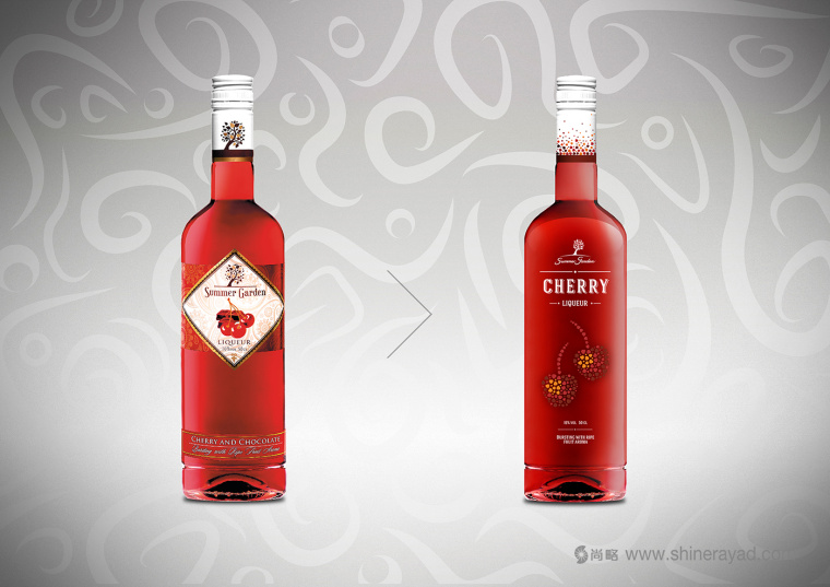
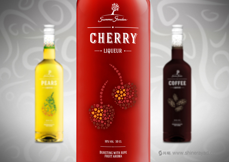
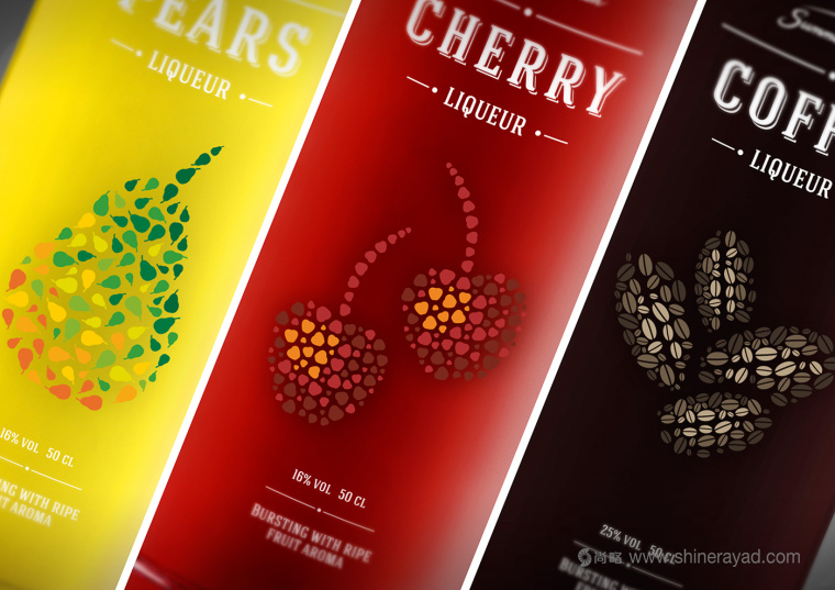
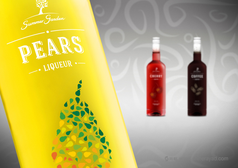
expressive color we decided to use no label look. In this way, a stylized
graphical fruit becomes the main accent on the label, therefore emphasizing
sweetness. The logotype was also updated to give it more identity as well as to
make it more playful. For the cap we have used a white matte finish (with some
added neutral gray elements) and glossy colored stripe. Those two elements
combined help creating a contrast with a bottle yet strengthening the taste of
liqueur itself."
夏日花园是有着甜水果味的酒精饮料。目标市场是年轻一代。因此这个项目的目标是更新设计来强调产品的特点,突出它温和的口味以此让它对年轻消费者更具吸引力。因为这个饮料包装的颜色非常丰富也很有表现力,因此我们决定不使用常规的标签。这样一个程式化的水果图案成为了包装上的主角,以此来强调饮料的甜度。Logo设计也有所变化,显示的品牌定位更清晰更有趣了。瓶盖使用的是添加了中灰色元素的白色磨砂表面,高光的彩色线条。这两者的结合能够创造出对比的效果来强调饮料本身的味道。
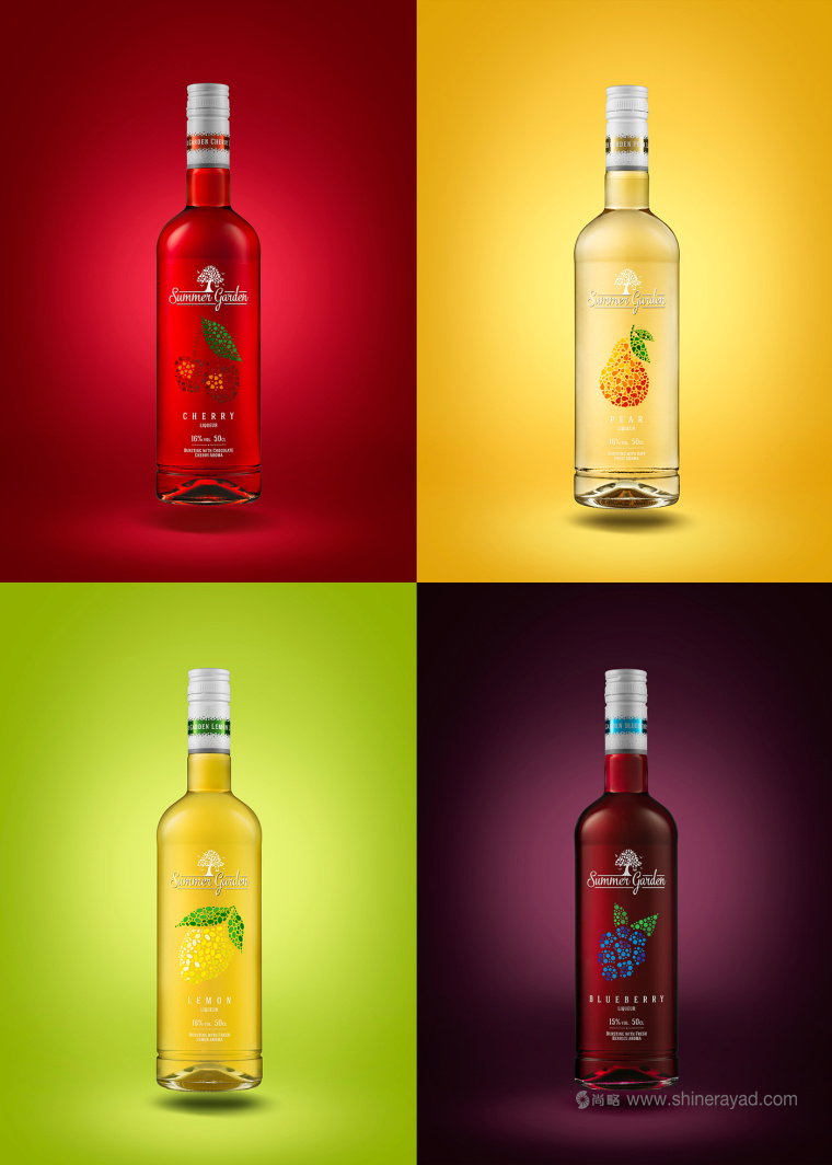
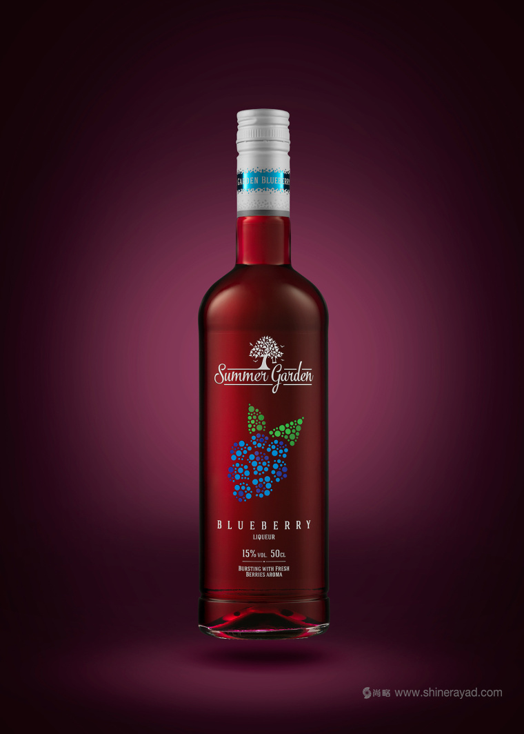
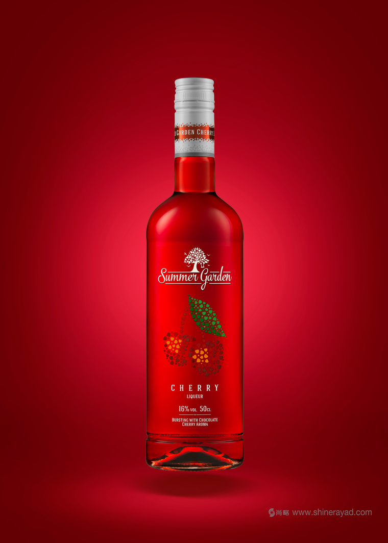
这是设计师最初夏日花园酒精饮料包装设计作品。
尚略上海品牌策划设计公司快速导航: